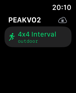
PEAKVO2
ReleaseNotes
Testflight Release: 1.0 (96)
This is version of the application is focused on optimizing your VO2 max
through high-intensity interval training.
4x4 Interval:
The workout is set as a “4x4 Interval” session, featuring four minutes
of high-intensity exercise followed by four minutes of lower intensity
or rest, repeated for a set number of intervals.
Outdoor Workout:
The interval workout is specifically designed for outdoor environments,
utilizing GPS for accurate tracking and adjusting to environmental
factors like terrain.
Running Figure Icon:
The running figure icon indicates that this interval workout involves
running
Cloud Icon with Arrow:
The cloud icon shows that your workout data is either being synced with
a cloud service or stored locally for future upload. If the cloud icon
does not become green, please make sure you are logged in to iCloud.
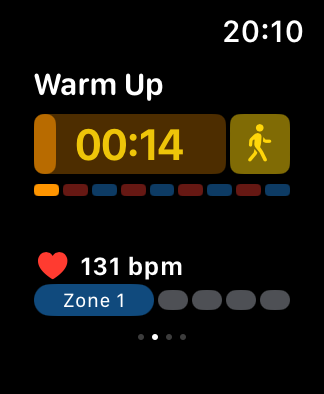
Warm Up Phase:
The workout starts with a warm-up phase, displayed with a countdown
timer. The yellow walking figure icon indicates that this phase involves
a low-intensity warm-up. The colored bars below represent different
intensity zones, with the first segment in yellow, corresponding to the
warm-up.
Heart Rate Zone Monitoring:
The heart rate is actively monitored during the workout, currently
displaying 131 bpm. The user is in Zone 1, which is the lowest intensity
zone, indicated by the highlighted first dot in blue.
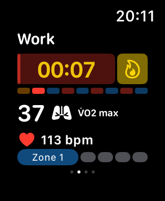
Work Phase:
The second phase is the work phase. The red background and flame icon
indicate high-intensity exercise. The colored bars show the user’s
progress across intensity zones. The VO2 max value is displayed as 37.
You want to reach as high a value a possible while reaching zone 5 and
maintaining a pace that can be endured for 4 minutes.
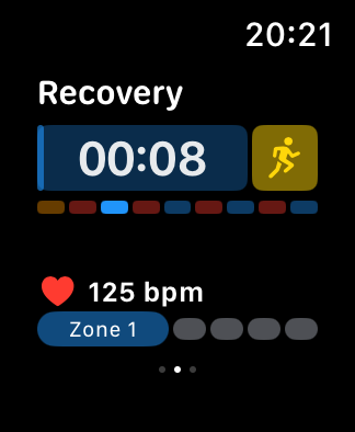
Recovery Phase:
The final phase is the recovery period. The blue background and running
figure icon suggest a transition to a lower-intensity recovery.
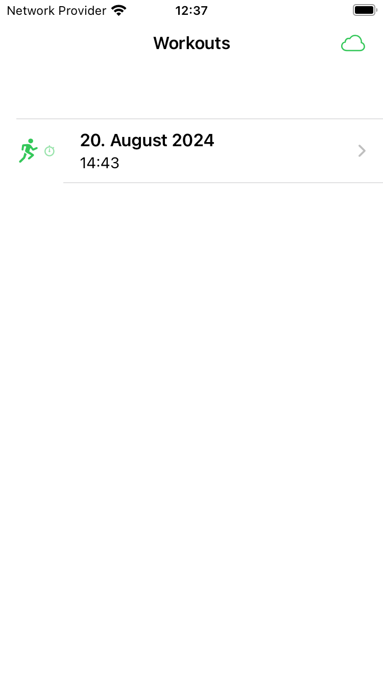
Workouts Overview:
The main screen displays a list of recorded workouts. Each entry shows
the date and time of the workout, with a running icon indicating the
type of activity. The cloud icon at the top right corner indicates that
your data has been synced.
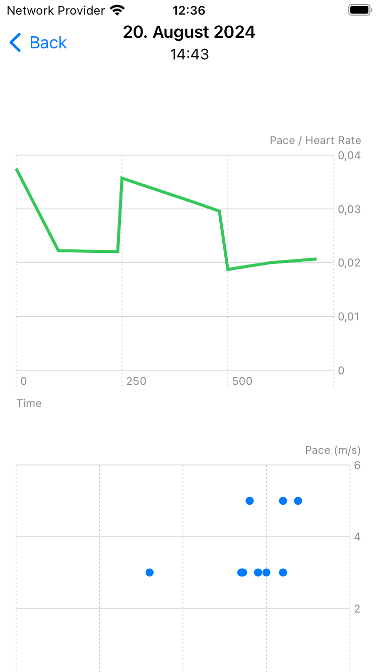
Workout Detail View:
When a workout is selected, the detailed view shows the date and time at
the top, with visual graphs providing insights into your performance.
Pace/Heart Rate Graph:
The top graph illustrates the relationship between pace and heart rate
over the duration of the workout, the higher the pace/heartrate ratio
the better your performance and your VO2 Max.
Pace Distribution Plot:
The lower graph displays your pace in meters per second (m/s) in
relationship with your heart rate. Older measurements will appear gray
and can be compared with the current one. If your pace increases while
maintaining same heart rate this is also an indicator of an improved VO2
Max.
Thanks for your feedback! You can either write it via Testflight or at [email protected]